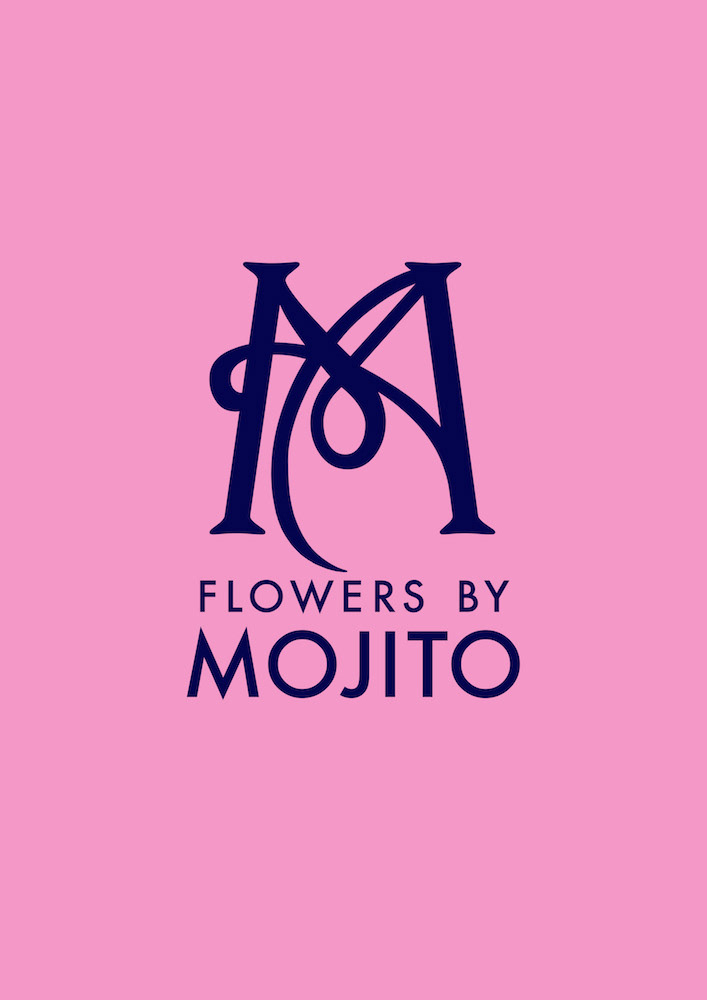
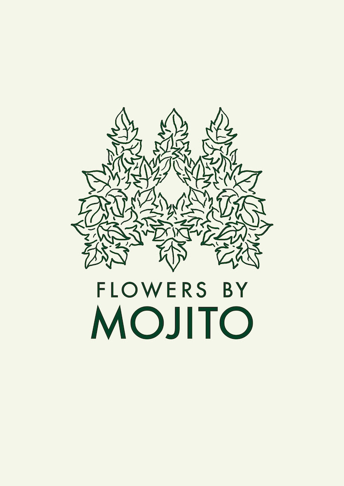
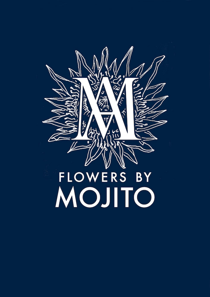
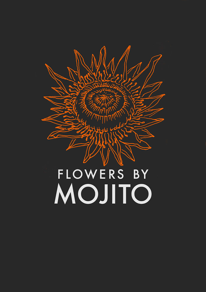
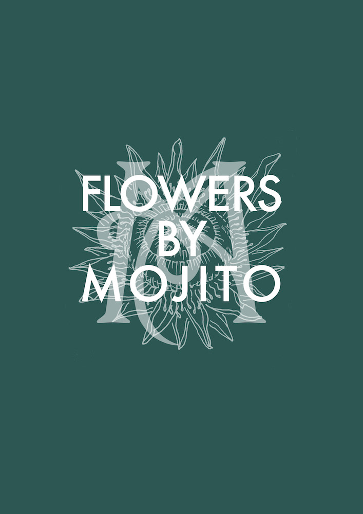
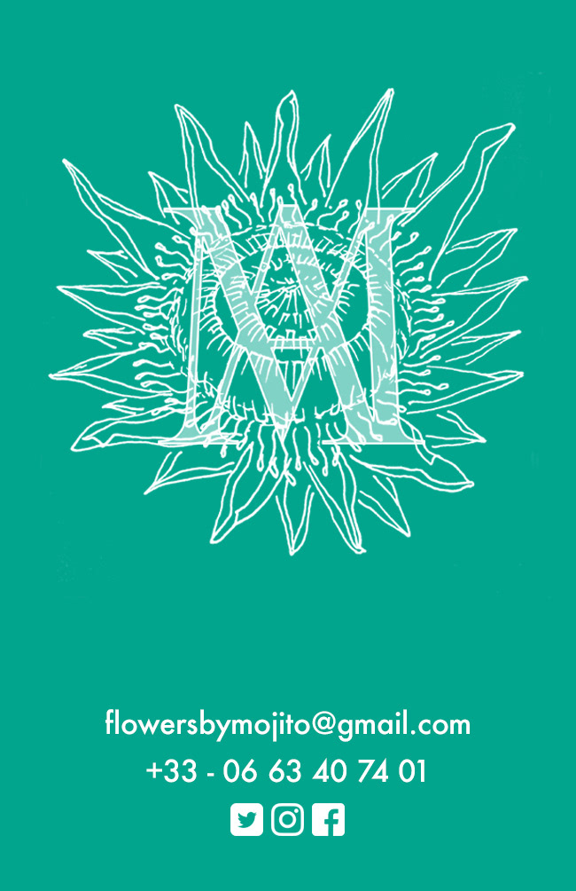
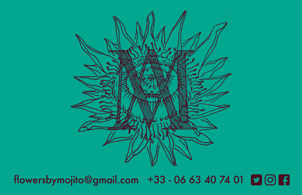
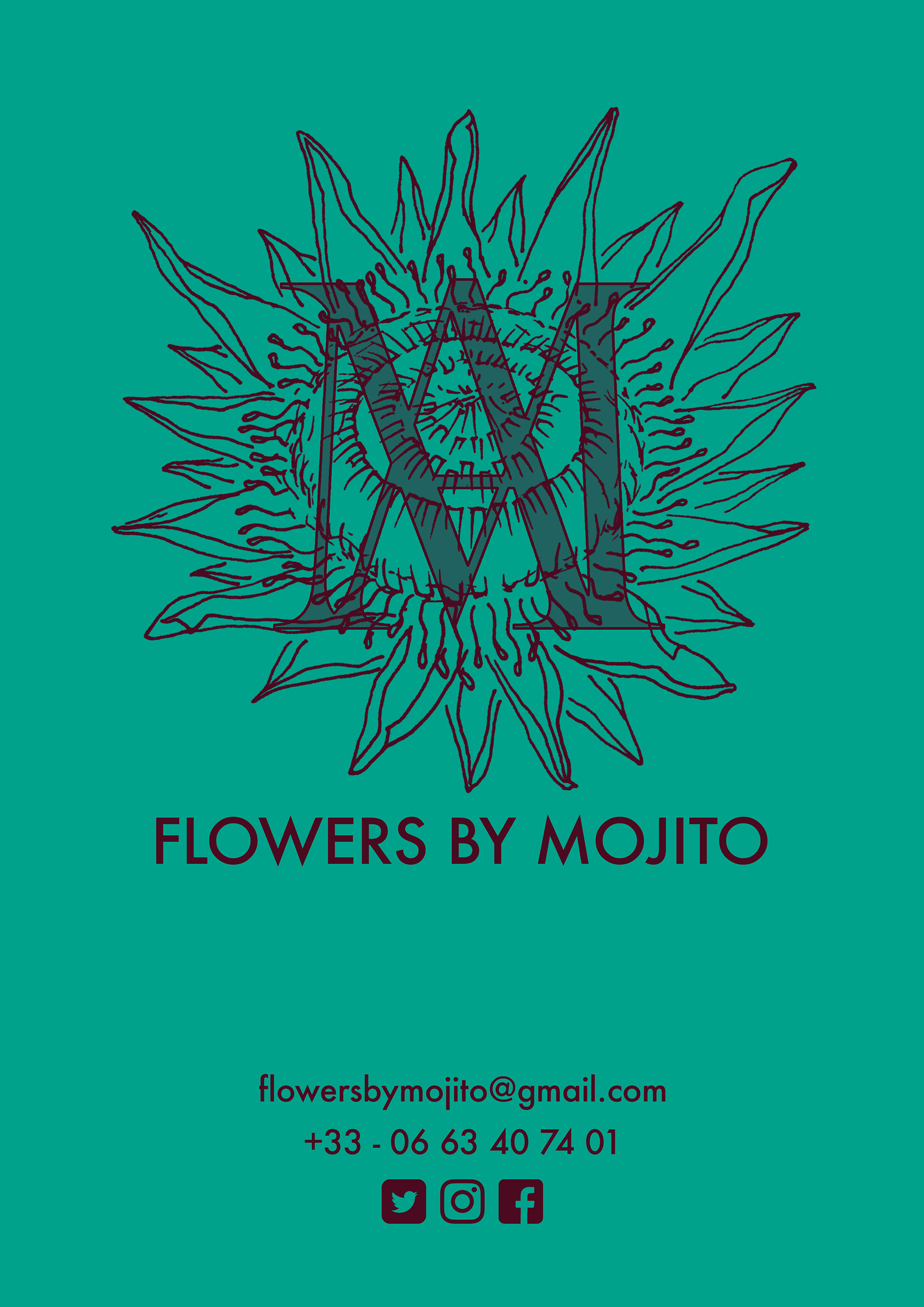
Branding options and the final selected versions and colour scheme. As instructed by the brief, the work was based around the owner's initials and my drawings of flowers from where they were born and grew up (Brasil and South Africa). Green was chosen as the main colour fairly quickly, with the final logo and text in aubergine, incorporating MA (inspired by Marie Antoinette's logo) and the Protea line drawing.